I haven’t actually used my camera this week (a very unusual situation) but I have been thinking about the different way an artist might approach an image via a sketch and a photographer that just needs to press the shutter. They are quiet different approaches yet they are both about being able to “see” the final work.
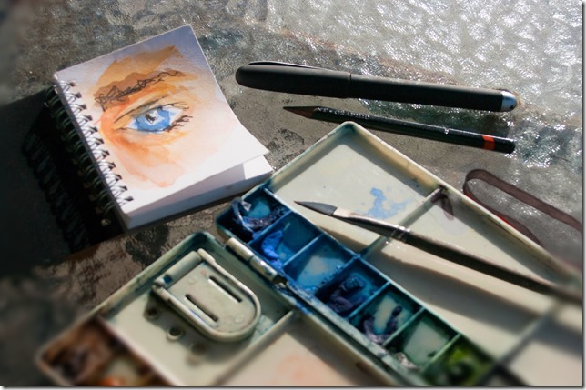
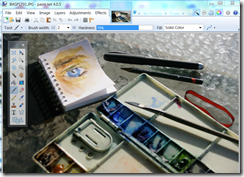 This is a photo of my small sketchbook and sketching gear. I have drawn a quick watercolour sketch of my own eye. It is in fact the small A7 sketchbook that I carry in my camera bag, taken last weekend as I was waiting for the sketch to dry. It is a nice example to explain the difference in an artist’s approach to seeing via line, tone and colour. It is also a nice bit of artistic self reference as I have long used such an image as my blogger and more recently google+ profile photo. I am also going to use Paint.NET, which is still free to download, (donations are appreciated) and a wonderfully simple yet powerful and intuitive photo editor for this demonstration. See also my post on the anatomy of Paint.NET Workspace
1. Line
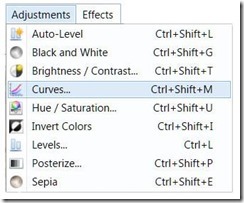 It is very common for an artist to begin with lines. Our eye love lines and edges, they quickly follow these subconsciously. Eye tracking is a relatively new high tech applied science with lots of applications, and it demonstrates that our eyes tend to follow lines almost involuntarily. Artist have traditionally realised this intuitively and they selectively lay down the lines they need to build their image, so as to capture the viewers gaze. Often these lines are edges, something that is the boundary between light and dark or just a thin change of contrast. Whilst an artist will probably use a pen or pencil a photographer can easily find the strongest lines by converting their image to just black or white. Some software give this as a separate tools with a threshold
 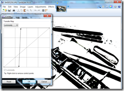 slider that changes the point an image changes from black to white. Another common way to achieve this is using the “curves” (tone curves). These are a very mathematical looking tool but they just allow you to remaps given luminosity (light intensity or tone) and often colours with considerable precision. In this example, using Paint.NET the horizon axis represents the input intensity and the vertical axis represent how this intensity is to be output. The upper right is the lightest tones (the whites) and the lower left is the darks (the blacks) So if I grabbed just the luminosity curve and move that point up to the top of the graph suddenly and tones this shade and lighter become white. If I then grab a nearby point just to the left and take it down to the base of the graph, suddenly all these tones and darker become black. If I moved these points horizontally the threshold of the black to white change moves through the tones. I’ve chosen a threshold that avoids focussing on the eye sketch itself. What is created is a black and white silhouette that highlights all those strong lines that out eyes like to follow. This is very useful in understanding our eye flow and establishing points of interest. An artist “trick” is look at their sketch upside down (in this case I’ve simply done a flip vertically) as this tends to let them see the shapes in a more abstract way rather and interpret the objects they represent.
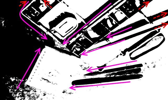 The pink lines show the likely flow of the eye. Those that bringing the eye into a center of interest, such as my eye sketch in this case, will be keys to help the artist build his composition. A photographer should also study these lines and help in the composition because they might need to be enhanced during post processing. Unfortunately strong lines at the boundary (the red dotted arrows) will tend to draw the eye out to the edge and possible away from the image. An artist would probably not even drawn these, however it will be important for a photographer to see these and perhaps dampen them in the post processing, by using a vignette or central focus that blurs the edges, or even a gradation mask and Gaussian blur.
It is probably unnecessary to keep this liner version of your image, so just Undo these “enhancement” with a couple of <Ctrl> <Z> or clicks on the big blue back arrow icon on the menu bar.
2. Tone
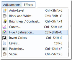 Most artist know that half squinting their eyes tends to desaturate the image and allows them to better judge the tone of the subject. Tone is “king” in realistic painting/sketching and it is important to understand how that tone maps onto lines and shade on the page. Where are the darkest darks and lightest lights? There are lots of ways to convert a colour image to black and white, edit tools, presets, filters and plugins.
  However for the tonal sketch aspect the simplest and best way is just to remove the saturation by moving that slider to the right. in this example I have moved the slider all the way to the right.
Half closing the eyes has a slight disadvantage in that it also lowers the light entering your eyes and thus darkens the image a little. There is no need to replicate this.
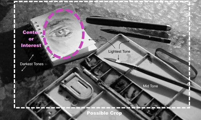
This black and white (actually its a greyscale) image should really help you understand the distribution of tone. Where the darkest tones are, where the lightest tones are and how these tonal areas connect. Often it is the areas of greatest contrast that interest our eyes and make for natural centers of interest. I find this greyscale images is also very helpful in guiding composition, ie the best way to crop the image. Notice I’m not trying to follow the rule of thirds I’m just trying to balance line, form & tone.
Once again it is time to hit <Ctrl><Z> and undo any changes and get back to the original image.
3. Colour
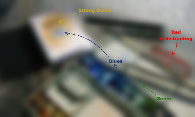
 Another trick some artist know about is “defocusing” your gaze. This is a bit of a challenge if you haven’t done it before. The idea is to deliberately make yourself cross eyed and your eyes will no longer be well focused. What you hopefully see is really the dominant areas of colour. To train yourself to do it hold up your finger, or better still your pencil, focus on just its tip and bring it closer to your nose. With a little practise you should be able to remove the pencil and take in the whole defocussed view. Of course this is much easy to do with your
  camera (for example on a DLSR you just grab the focus ring and crank the lens out of focus while looking through the viewfinder). You will be surprised how much of the detail is gone from the image but you will still be able to make out the dominant colours.
The green to blue (harmony), then to blue against strong ochre (yellow) contrast works well, but the red of the rubber band distracts from this. A photographer might reach in and remove the rubber band (if the defocussing was done in the camera before the photo was taken). Alternatively this could be masked and selectively desaturated in post processing.
Time for <Ctrl> <Z> again, to Undo. You may or may not have saved these versions but you should have seen a few extra things in your photo that will probably help you enhance the photo during post processing, much like an artist referring back to his sketch book.
No comments:
Post a Comment